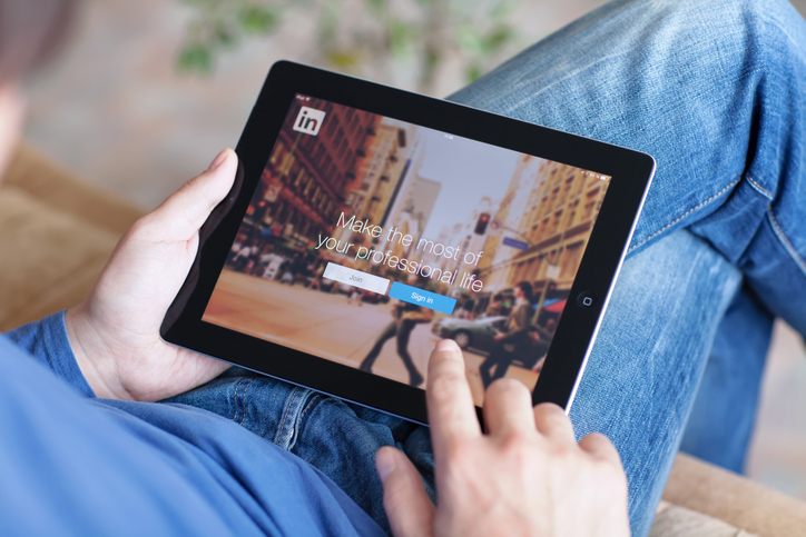
For a lot of businesses, the LinkedIn company page is an overlooked part of a digital marketing strategy. It’s understandable: LinkedIn has built its reputation on being the more straight-laced, buttoned-up version of flashier social media sites like Facebook or Twitter. That approach has largely worked, as LinkedIn filled an important niche with a focus on networking, talent acquisition, and business-focused information sharing. At the same time, the reality is that most of its users were also spending a lot of time on other, more design-friendly social networks, and many parts of the LinkedIn layout were confusing.
Enter the new LinkedIn redesign. It all started with an overhaul to the mobile experience in late 2015. This featured a major shakeup in how the social network organized its information for the user. Instead of feeling like a directory, this redesign placed the emphasis back on the user, with first-person categories that included “My Network,” “Messages,” and “Me.” Messaging was revamped to feel like, well, a messaging app, and not some proprietary walled-garden version of email. Notifications were reorganized so you can glean more information at a glance and not feel overwhelmed.
The updates to LinkedIn’s mobile experience were followed a little later with a new version of the site’s company pages, which started going live to select businesses in late 2016. This update streamlined the look of these pages for a cleaner user experience while reorganizing the information into new categories. That beta went smoothly, which laid the groundwork for the latest and greatest: LinkedIn’s 2017 desktop redesign.
How LinkedIn Has Changed
If you haven’t had a chance to fire up LinkedIn since the redesign, now is a good time to hop over and take a look at what’s going on. The first thing that’s readily apparent is how similar it is in design to Facebook. The structure is almost identical: a link to your profile on the left; a center column populated by an endless string of content from your network underneath a prompt to share your own; and even the ad placement in the right-hand column.
The centralizing and prioritizing of content is a key part of LinkedIn’s bid to make the social network a little more business casual. You’ll notice that posts are expandable within the timeline and that the formatting tends toward visually emphasizing the content: pictures pulled from a link, bold headlines, snippets of the discussion that has started about the post, etc. We’ll come back to this when we look at the new company page, but for now, the thing to note is that LinkedIn has adapted its design to make posts that are more in line with other social networks, making it easier to optimize and adapt content across platforms.
The final thing we should look at on the homepage is the revamp of notifications. It used to be that any and every interaction you had on LinkedIn would all be a part of the same massive list. You’d see the familiar red circle with a big number in it, but when you pulled down the menu, it was hard to see what all the fuss was about. By breaking notifications into several categories, it’s easy to tell at a glance if that person you messaged has gotten back to you, or if it’s one of those requests to connect that have been piling up in your inbox.
How Company Pages Have Changed
Now that we’ve familiarized ourselves with how LinkedIn has changed in general, it’s time to take a look at company pages. For starters, let’s take a look at an organization that has had access to the new features for a while and devoted resources: GE.
You’ll immediately notice that the first impression is much more visually striking than the old format. The banner image is still there, but instead of going straight to the “About Us” content, like a listing, there are instead three categories, each with a visual attached to it: “Overview,” “Jobs,” and “Life.” The Overview page, which you start on, has made the “About Us” box expandable, making it easier to scroll down to see what showcase pages and content the company has posted.
Again, it’s important to note the emphasis this new design has placed on bold titles and compelling images. You no longer have to spend time summarizing your posts, but instead, you’ll need to pay more attention to tried-and-true social media optimization techniques: images to underscore your text posts, compelling headlines that grab the reader’s attention, and content that starts a conversation.
Jobs is pretty self-explanatory—it auto-populates with any positions you may put up for your company. If you scroll down, however, you can find some fun analytics about GE’s employees that might be interesting.
Finally, take a look at the Life section, which is perhaps the most engaging. GE supports some excellent copy about their company with some nifty embedded videos, a smattering of photos, and featured Pulse posts by different C-Suite leaders. The photos show up on the Overview page as well, so it’s important to make sure that these are carefully chosen to reflect your culture.
Optimizing Your Business Page
We’ve spent a lot of time breaking down LinkedIn’s changes because the key takeaway has to do with how the redesign affects the visual experience of moving through the site. The increased emphasis on images and titles brings it more in line with what works on Facebook and Twitter, and it seems clear that the goal of this is to increase engagement by making posts both more compelling and familiar. These changes are great for optimization because more engagement means you’ll get noticed and get boosted.
At the same time, a strength of LinkedIn as a platform is Pulse. If you take a look at key influencers, you’ll notice that their usage includes a mix of short interactions (commenting, likes, conversations), standard social media posts (e.g. sharing articles with some observations), and longer-form content on Pulse.
Because LinkedIn is all about breaking companies down into networks of individuals, it’s important to realize that at its core, optimizing is going to be all about how you use your company’s profile to amplify the activity of your employees. The old maxim is still true: people buy from people.
What You Can Do Right Now
LinkedIn’s design overhaul is pretty major, but at the end of the day, it makes the platform more engaging and less clunky. Will this result in an increase in user activity? Time will tell. In the meantime, there are some important things to realize about how the redesign will affect your business, and what you can do to optimize for them.
-
Take the time to acquaint yourself with the newsfeed– notice which posts catch your eye and why.
-
Look at industry leaders to see what works, and what doesn’t.
-
Build a mix of content with Pulse, your newsfeed, and direct engagement.
-
Use your company page to amplify your employees’ activities.
- Newport Investors Summit: A Hub of Innovation and Community Collaboration - November 8, 2024
- Celebrating the NWA LPGA Championship: A Community and Sporting Triumph - October 23, 2024
- Why Local and State Governments Must Scale Broadband Infrastructure Now - October 16, 2024


